Logo system
Six logo families with purple, white and black base colours. Every wordmark has a capital U and orange Up.
Download the complete brand kit for your next website, presentation, social post or printed piece. Start with the same logos, colours and templates.
Updated identity · SVG, PNG, PDF, fonts and editable templates


Six logo families with purple, white and black base colours. Every wordmark has a capital U and orange Up.
Favicon, bird app and touch icons, maskable icons and compact B symbols.
Colour tokens and gradients in CSS and JSON, Poppins font files and typography guidance.
Editable business card, letterhead and email signature with the current logo.
Current icons and editable cover, post and story templates.
Editable presentation and web banner templates using the corrected BrandlyUp identity.
The updated ZIP includes corrected logos, icons, colour tokens, fonts, guidelines and editable templates. Personalise sample contact details and campaign copy when reusing templates.

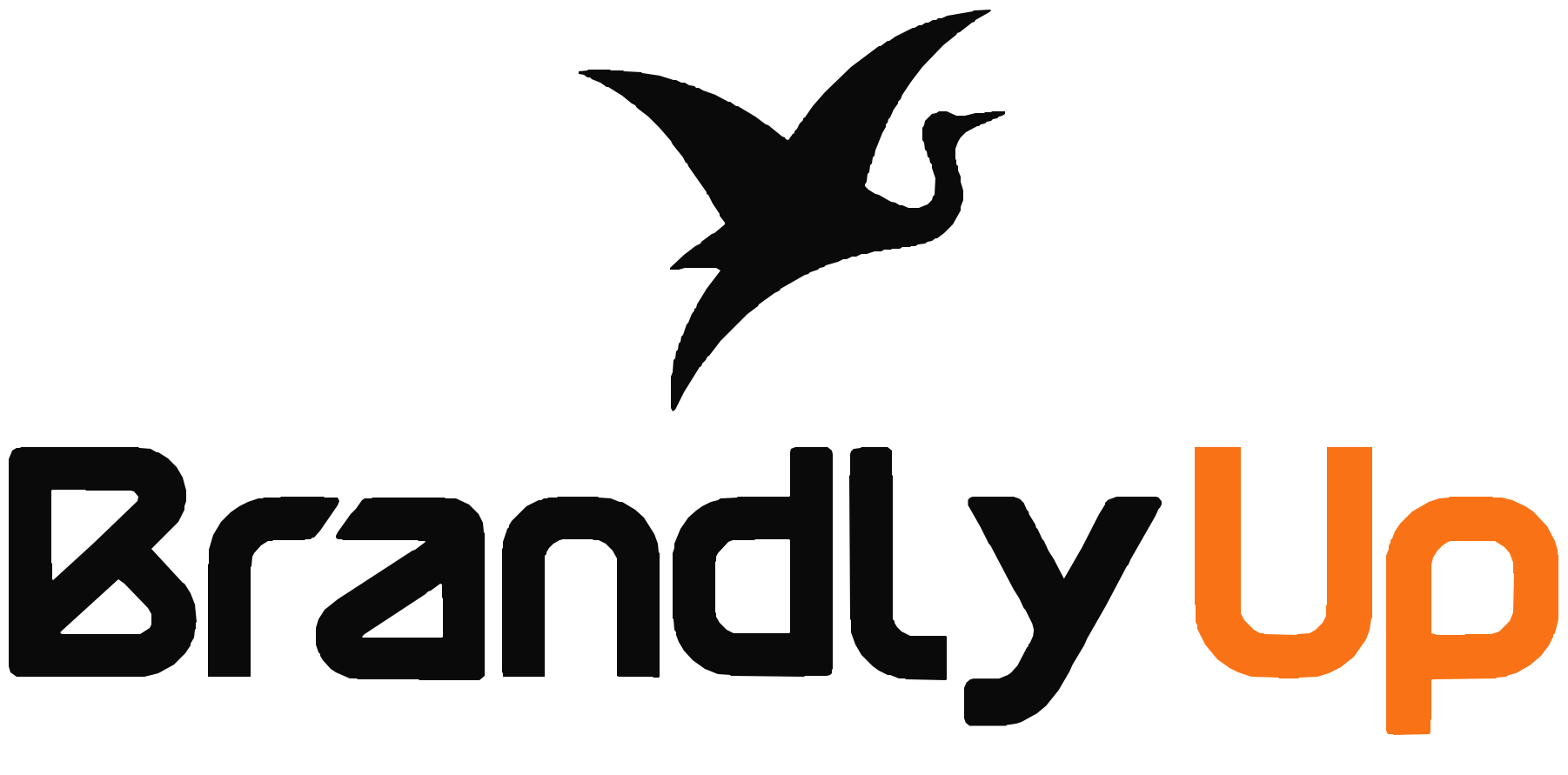
Use the integrated bird logo for brand introductions, the website header and footer, and share previews.

An alternate wordmark for compact, text-led applications and email signatures.

The website favicon, phone home-screen icon, app icon and profile avatar.
An alternate compact identity for small badges and narrow placements.
A combined identity for campaign badges and supporting graphics.
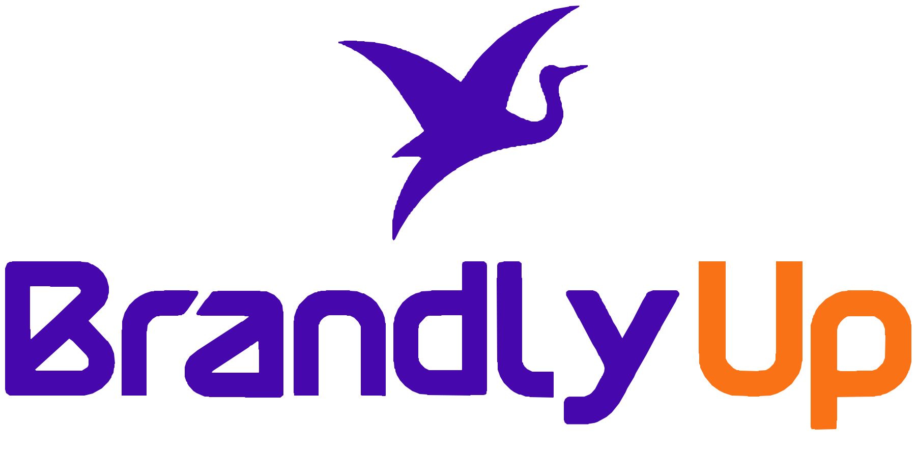
A centred lockup for square layouts, covers and presentations.

Use the white base on dark backgrounds. Keep Up orange in every wordmark variant.
The crane lifts the orange Up while Brandly stays steady. Preview the supplied animation or download the website loader for reuse.
Keep clear space equal to the height of the inner counter of the B around the logo. When that reference is unavailable, reserve at least 10% of the logo width. Scale proportionally and keep the silhouette clear.
| Artwork | Minimum digital width | Minimum print width |
|---|---|---|
| Primary logo | 140px | 32mm |
| Wordmark | 100px | 24mm |
| Bird symbol | 24px | 6mm |
Write BrandlyUp with B and U capital. Use purple Brandly on light backgrounds and white Brandly on dark backgrounds; Up stays orange. Scale proportionally and avoid stretching, rotation, outlines and effects.
#4608AD
Identity and primary actions.
#F97316
The Up suffix in every wordmark. U is always capital.
#7A3EF7
Supporting accents and gradients.
#9B5CFF
Highlights and decorative graphics.
#C4AFFF
Borders and quiet accents.
#0A0A0A
Headings and strong text.
#F5F4F8
Reading surfaces and cards.
#FFFFFF
Light backgrounds and reversed artwork.
Poppins Bold for display headlines, Semibold for headings, Regular for body copy and Medium for UI labels. Arial and Helvetica are the fallbacks.
The website serves Poppins locally. The updated kit includes font files and their Open Font License.
Use practical, specific language and authentic photographs. Keep supporting patterns secondary to the main message. Campaign taglines in templates are editable.